Haynes Family Chiropractic Rebrand
Haynes Family Chiropractic, voted “Best of Peoria” in 2018, approached Lettering Works at the beginning of the year wanting to learn more about rebranding their successful family practice. The husband and wife team began their business in May 2014. Fast forward nearly five years, after lots of growth and development, they felt it was time for an upgrade to their look to reflect their personality, professionalism, and place in business. Their original logo was purchased online via a design competition platform. While they knew it wasn’t perfect or ideal, it was a good starting point. New businesses are almost always strapped for cash, making choosing which aspects of the business to invest in a tough decision. Investing in a quality logo upfront can save you the cost of rebranding later. But sometimes it takes some time in business to be able to get to the point where you can afford what you know you deserve.
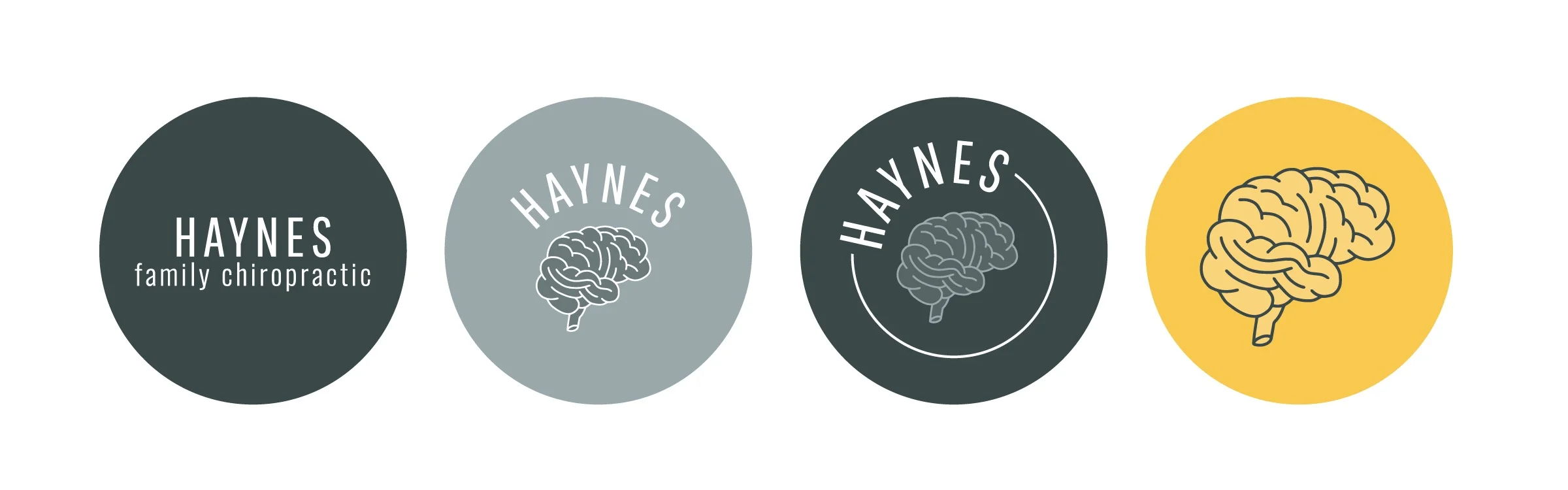
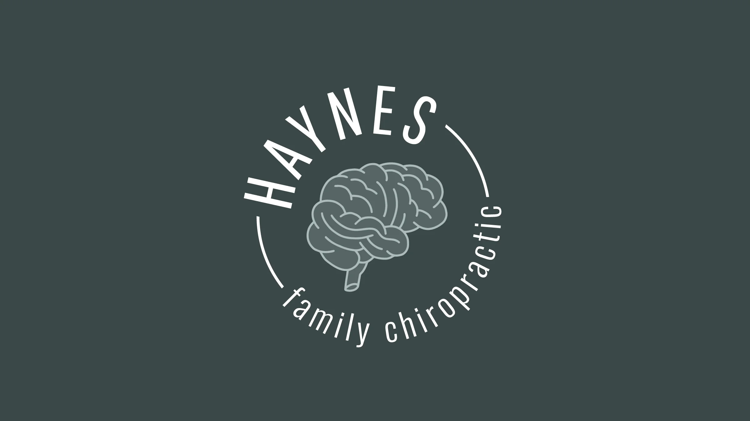
Dr. Christine knew that she wanted their new look to be clean, modern, and professional. After reflecting on the core focus of Haynes Family Chiropractic and exploring some design directions, she was drawn to including an image of a brain. Haynes often experiences a lack of understanding that she and her husband aren’t “bone doctors” but deal with the nervous system in their practice. While a graphic of a spine is typical for chiropractic offices, we wanted to differentiate them from the competition. They specialize in the Blair Upper Cervical Technique and their work is truly unique for the area. Incorporating a brain in variations of their logo and icons connects their business to the brain and nervous system and sets them apart from what is currently saturating the market design wise. If someone isn’t sure of the reasoning for the brain icon - it at least opens up a conversation of how everything works and the important role the brain plays in the work that they do.

The process of working together included an in-person discovery meeting, online branding questionnaire completed by Dr. Christine and her husband Dr. Kyle, and multiple drafts of different design iterations that were informed by their ideas and goals. Their branding package included a logo design, color and typography selections, brand guidelines, and a set of brand icons. They opted to add on a few marketing materials as well - business cards, custom thank you cards, and appointment cards.
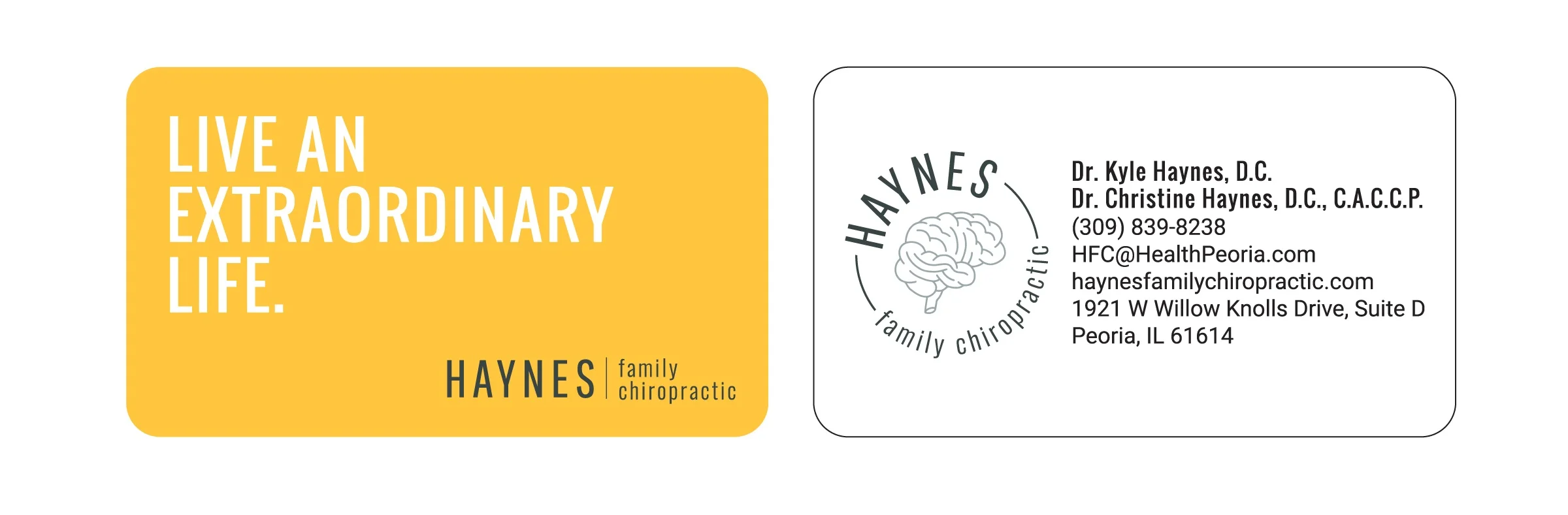
PRO TIP: When rebranding, think beyond the logo and guidelines. Hiring your designer to do a couple additional marketing pieces can go a long way in setting the tone for all future pieces and take some of the guesswork out of translating your new brand to new (or existing) deliverables.
Effective branding requires a pretty intensive design process, so you should always go with someone you trust — someone who is willing to listen to you and learn about your business. A logo and brand identity often provides the first impression of your business to your target market, making it essential to have a strong representation of who you are. Rebranding offers an opportunity to constructively evaluate your business, find areas for improvement, and reimagine a solution that best represents your passion and confidence in what you do visually.
If you are needing a refresh of your brand’s visual identity, send us a message, We’d love to discuss what we can do for you.